Elements
The SaaS theme includes a number of elements to help you build your website. These elements are:
Anchor
Category: Content
The anchor element is used to create an anchor link on a page. It is useful for linking to specific sections of a page.
The name of the anchor can be adjusted in the Element Settings panel.
Benefits
Category: Content
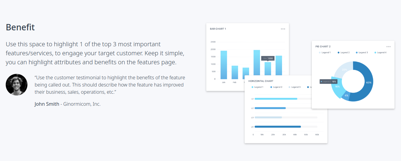
The Benefits element is designed to showcase a benefit or feature of your product or service. It includes a title, intro text, feature image and an optional quote or list of features.
The Quote or List can be toggled on or off in the Element Settings panel.
Contact
Category: Content
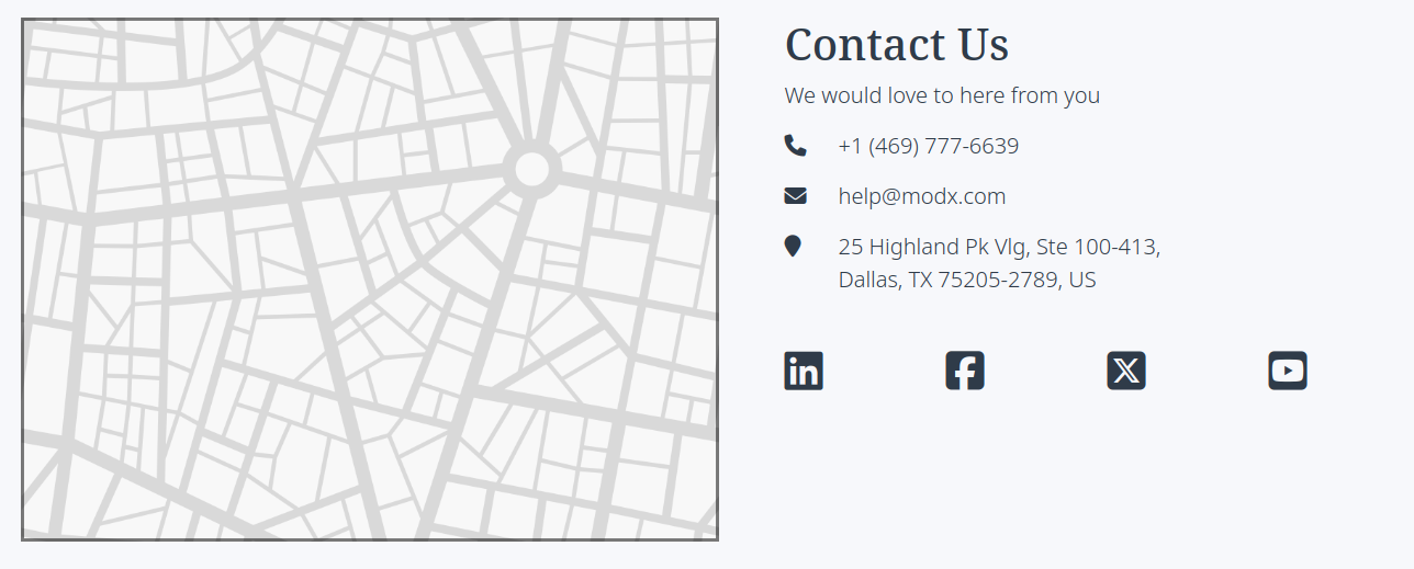
The Contact element is used to display contact information on a page. It pulls in the company name, email address, phone number, phone extension and address from the Theme Settings, as well as the Social links.
The Contact element features a generic map image that can be replaced with a custom map image or photo by clicking on it.
Customers
Category: Content

The Customers element is used to showcase logos or names of companies that use your product or service. The number of logos displayed can be adjusted in the Element Settings panel. As well as the style of the logos.
To swap the text for logos, click on the text and select the image icon in the toolbar.
Font Awesome Grid
Category: Content

The Font Awesome Grid element is used to display a grid of Font Awesome icons. The icons can be selected from a list of available icons by clicking on them. The number of icons displayed can be adjusted in the Element Settings panel.
Horizontal Rule
Category: Content
The Horizontal Rule element is used to create a horizontal line on a page. It is useful for separating sections of content.
Large Image
Category: Content

The Large Image element is used to display a large image on a page. The image can be replaced with a custom image by clicking on it.
Pricing Columns
Category: Content
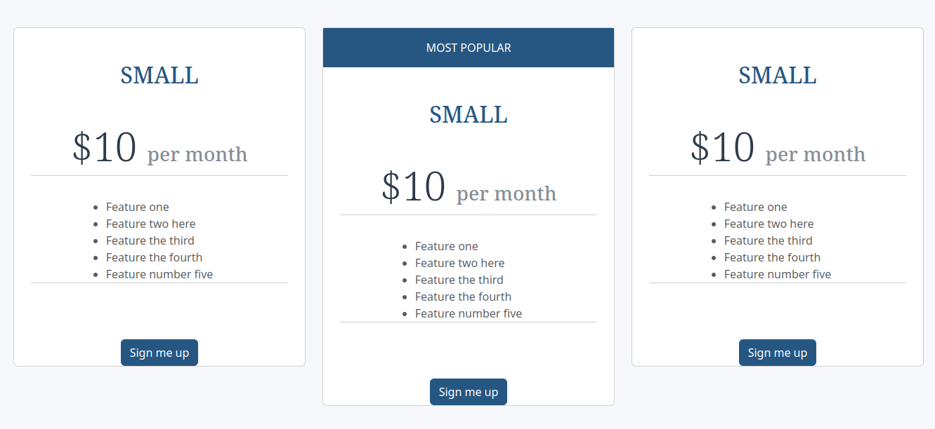
The Pricing Columns element is used to display pricing information in a column layout. The number of columns can be adjusted in the Element Settings panel. You can also adjust the "Featured" column in the Element Settings panel.
Quote Box
Category: Content
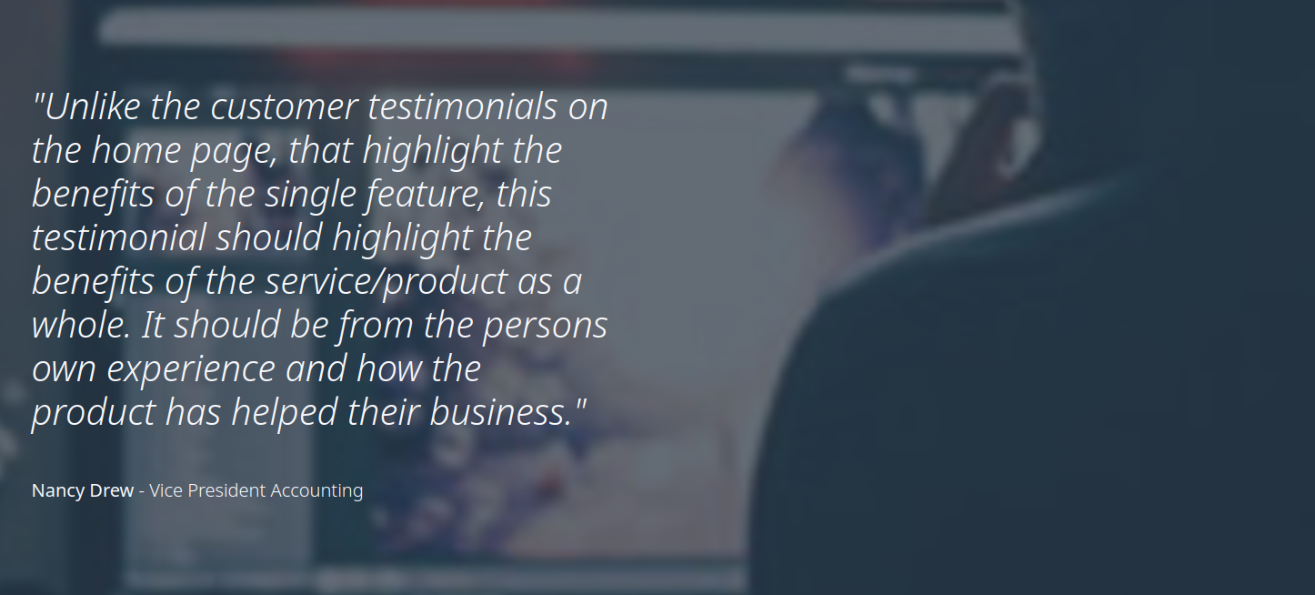
The Quote Box element is used to display a quote on a page. The background image can be replaced with a custom image in the Element Settings panel.
Rich Text Columns
Category: Content

The Rich Text Columns element is used to display text in a column layout. The number of columns can be adjusted in the Element Settings panel. You can also select the position of the Header or hide it in the Element Settings panel.
Interior Header
Category: Headers
Templates: SaaS Main

The Interior Header element is used to display a header on a page. The header can be customized with a title, subtitle and a call-to-action button. The button can be linked to a page or an anchor on the same page. The button can be toggled on or off in the Element Settings panel.
Product Hook
Category: Headers
Templates: SaaS Main
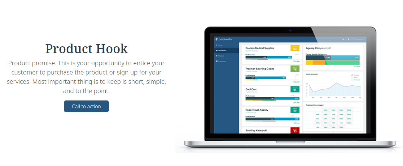
The Product Hook element is used to display a header on a page. The header can be customized with a title, subtitle and a call-to-action button. The button can be linked to a page or an anchor on the same page. The button can be toggled on or off in the Element Settings panel. The image can be replaced with a custom image by clicking on it.
Action Block
Category: Sidebar
Templates: SaaS Blog Home
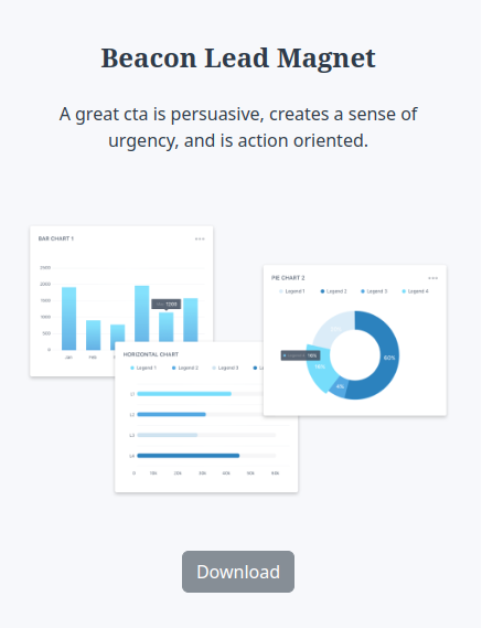
The Action Block element is used to display a call-to-action block in the sidebar. The block can be customized with a title, subtitle and a call-to-action button. The button can be linked to a page or an anchor on the same page.
Recent Articles
Category: Sidebar
Templates: SaaS Blog Home
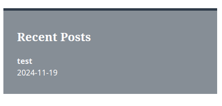
The Recent Articles element is used to display a list of recent articles in the sidebar. The number of articles displayed can be adjusted in the Theme Settings.