Options Detailed
Option Sets can have global settings for things like Media Sources and controlling whether or not dynamic asynchronous XHR calls should occur. The visual Settings that display in the browser, can also have sub-sets that serve to keep things organized.
Global Settings
The followng control individual settings and grouping for an Element in a Fred-powered page.
remote
Set to true to cause XHR requests to render the Element through both the Twig and MODX parsers. The element also re-renders through both the Twig and MODX parser when you change element settings. This means you can have dynamic content that references other pages within a Fred page using MODX Snippets. Default: false.
cacheOutput
This will cache output of an element to static HTML when set to true and when the previous remote global setting is also set to true.
mediaSource
Name of the Media Source to use for Finder. Multiple Names can be passed separated by comma ,.
imageMediaSource
Name of the Media Source to use for Image fields. Multiple Names can be passed separated by comma ,. This option overrides mediaSource.
toolbarPluginsInclude
List of toolbar plugins to enable for elements.
toolbarPluginsExclude
List of toolbar plugins to disable for elements.
Settings
Settings are made of a JSON array of objects and group objects which provide configuration controls for Elements. Settings can import subsets of settings using a fred-import object.
Settings properties
The following properties apply to all settings, regarless of the types below:
name- Name of the setting, can be used as a Twig variablelabel- Setting's Label, displayed in the Element Settings panelvalue- A default valuetype- Type of the setting, see next section
Note: for the best end-user experience, it is a good idea to set a default value so end users have a starting point to work with. Otherwise it may be confusing due to having a blank Element that may not match the preview image when dragging and dropping into pages.
Available Settings types
The following Settings types are used to configure Elements in Fred.
text

- A single-line HTML
<input type="text">element - Can have any text value
- Returns - A string
textarea

- A multie-line HTML
<textarea>element - Can have any text value
- Type specific properties:
rows- The number of rows to show; Default: 4
- Returns - A string
select

- An HTML
<select>list element - Only supports a single select value
- Type specific properties:
options- An object of"value":"label"properties
- Returns - A string with the selected value
toggle

- true/false checkbox
- Returns - A logical
trueorfalse(0or1if output as a string)
togglegroup

- A checkbox group
- Type-specific properties:
options- An object of"value":"label"properties
- Returns - A double-pipe
||separated string of checked values
colorswatch

- Visual color picker, to choose from predefined values
- Type-specific properties:
- options
- An array of colors; Example:
["lightcoral", "red", "black"] - Color can be either a
stringor anobjectwith following properties:value- the value passed to Twig for the color, which can be anythingcolor- the displayed color for the swatchcolorAsClass- if set totruethecolorvalue will be added as a class to the option, instead of setting as a backgroundlabel- an arbitrary label for the swatchwidth- width of the color option, default is1
- An array of colors; Example:
- options
- Returns - A string of the color value
colorpicker
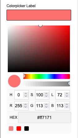
- A color picker that supports arbitrary color definitions including RGB, HSL or Hex values with optional opacity
- Type-specific properties:
showAlpha- A boolean to show an alpha transparency slider; Default:trueoptions- An array of colors; Example:["lightcoral", "red", "black"]
- Returns - A string of the color's hexadecimal value
slider

- An input slider for numbers
- Type-specific properties:
min- REQUIRED: The minimum value of the slidermax- REQUIRED: The maximum value of the slidertooltipDecimals– Number of decimals to show in the slider’s tooltip; Default: 0step– A number to increment the slider’s value; Default: 1
- Notice: To avoid issues with this option, set a default
valuewithin the range ofminandmax - Returns - A number
page

- MODX Page select
- Type-specific properties:
clearButton- If set totrueanxbutton shows in the input field allowing a user to clear any set valueresources- If set, only resource with specified IDs will show; Value can be string with a comma as a separator or an arrayparents- If set, only resource from these parents (including parents itself) will show; Value can be string with a comma as a separator or an arraydepth- Depth to look for children for specifiedparents; Default: 1
- Returns - An object with
idandurlproperties- Referencing ID or URL alone is done through the dot syntax:
{{ page-name-example.id}}
- Referencing ID or URL alone is done through the dot syntax:
chunk

- Chunk select
- Type-specific properties:
chunks- Comma separated list of chunk names/ids to showcategory- Comma separated list of category names/ids to show chunks from
- Returns - An object with
idandnameproperties- Referencing ID or URL alone is done through the dot syntax:
{{ chunk-name-example.name}}
- Referencing ID or URL alone is done through the dot syntax:
file

- File picker
- Type-specific property:
mediaSource- Optional name of the Media Source to use that overrides the top-level<a href="#mediasource">`mediaSource` global setting</a>
- Returns - A string of the file path
folder

- Folder picker
- Type-specific property:
mediaSource- Optional name of the Media Source to use that overrides the top-level<a href="#mediasource">`mediaSource` global setting</a>showOnlyFolders- If set totrueonly folder will be visible in the elFinder; Default: false
- Returns - A string of the folder path
image
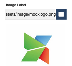
- Image select
- Type-specific properties:
showPreview- If set tofalsepreview won't appear under the text inputmediaSource- Optional name of the Media Source to use that overrides the top-level<a href="#imagemediasource">`imageMediaSource` global setting</a>
- Returns - A string of the image path
tagger

- Allows users to choose from preset Tagger tags
- Type-specific properties:
group- REQUIRED An ID of the Tagger group to useautoTag- true/false to show/hide the auto taghideInput- true/false to show/hide the inputlimit- Maximum limit of the number of tags that can be selected
- Returns - A string of comma-separated tag names
Setting Groups
Groups are used to organize related Option Sets, or to remove infrequently used settings from the main view.
group- Name of a group of related sub-settings that open when clicked in a secondary panel. The value of the group property will be used as the label for the groupsettings- An array of setting objects
{
    "group": "Group Name",
    "settings": [
        {
            …
        },
        {
            …
        }
    ]
}
Setting Name Conventions
Since the frontend is rendered through Twig, all "name" values need to follow JavaScript conventions. This primarily means hyphens, spaces and other special characters are not allowed as they may have reserved functions in JavaScript.
Joining Multiple Words in Setting Names
Underscore:
cta_title, cta_image, cta_link
Upper Camel Case (Pascal Case):
CtaTitle, CtaImage, CtaLink
Lower Camel Case:
ctaTitle, ctaImage, ctaLink
Example Option Set with Settings
{
    "remote": true,
    "settings": [
        {
            "name": "panel_class",
            "label": "Panel Classes",
            "type": "text",
            "value": "col-6 col-sm-12"
        },
        {
            "name": "logo",
            "label": "Logo",
            "type": "image",
            "mediaSource": "site-assets",
            "value": "assets/images/logo.svg"
        },
        {
            "name": "nda-file",
            "label": "Upload NDA",
            "type": "file",
            "mediaSource": "site-assets-files",
            "value": "assets/files/contract.pdf"
        },
        {
            "name": "slogan",
            "label": "Slogan",
            "type": "textarea",
            "value": "Enter your slogan here"
        },
        {
            "name": "panel_type",
            "label": "Type of Panel",
            "type": "select",
            "options": { "info": "Info Panel", "warn": "Warning Panel", "error": "Error panel" },
            "value": "info"
        },
        {
            "name": "padding_top",
            "label": "Top padding",
            "type": "slider",
            "min": 0,
            "max": 100,
            "step": 10,
            "value": 20
        },
        {
            "group": "CTA",
            "settings": [
                {
                    "name": "cta_class",
                    "label": "CTA Class",
                    "type": "select",
                    "options": {
                        "danger": "Red CTA",
                        "info": "Blue CTA",
                        "default": "Default CTA"
                    },
                    "value": "default"
                },
                {
                    "name": "show_cta",
                    "label": "Show CTA",
                    "type": "toggle",
                    "value": false
                },
                {
                    "name": "color",
                    "label": "Text Color",
                    "type": "colorswatch",
                    "value": "black",
                    "options": [{ "value": "primary", "color": "blue", "label": "Primary" }, "lightcoral", "black", "rgba(0,255,0,.5)"]
                },
                {
                    "name": "bg_color",
                    "label": "Background COlor",
                    "type": "colorpicker",
                    "value": "white",
                    "showAlpha": true,
                    "options": ["lightcoral", "black", "white"]
                },
                {
                    "name": "page",
                    "label": "Linked Page",
                    "type": "page",
                    "value": { "id": 1, "url": "[[~1]]" }
                }
            ]
        }
    ]
}